For our A2 Media portfolio, we have been asked to produce a teaser trailer, an advertising poster and a front page of a magazine. The guidelines for this product are very brief so it allows us to take it in any direction we choose. We have decided to study the horror genre as we have a passion for this genre, and enjoy the thrill you experience when watching a film of this type. We thought that having a passion for the genre would work to our advantage whilst producing our creative task. Our horror trailer will appeal to a wide target audience of 15 to 35. To guarantee we appeal to this age range, we plan to carry out exstensive research into what they enjoy to watch aswell as what they expect to see. We will also apply this research to the creation of our ancillary texts, a poster and magazine front cover.
Saturday 30 October 2010
Thursday 28 October 2010
HORROR GENRE
Horror films are unsettling films designed to frighten and panic, cause dread and alarm, and to invoke our hidden worst fears, often in a terrifying, shocking finale, while captivating and entertaining us at the same time. Horror films effectively centre on the dark side of life, the forbidden, and strange and alarming events. They deal with our most primal nature and its fears: our nightmares; our vulnerability; our alienation; our revulsion's; our terror of the unknown; our fear of death and dismemberment; loss of identity; or fear of sexuality.Horror films are often combined with science fiction when the menace or monster is related to a corruption of technology, or when Earth is threatened by aliens. The fantasy and supernatural film genres are not synonymous with the horror genre, although thriller films may have some relation when they focus on the revolting and horrible acts of the killer/madman.
Horror films go back over 100 years ago. From our earliest days, we use our vivid imagination to see shadowy shapes as ghosts, to be emotionally connected to the unknown and to fear things that are improbable. Watching a horror film gives an opening into that scary world, into an outlet for the essence of fear itself, without actually being in danger. We experience a very real thrill and fun factor in being scared or watching disturbing, horrific images, this comes down to our knowledge of knowing we are in no sort of danger but visually we feel like we are a part of the film. So we experience the adrenalin we would, if faced with what we were viewing, but its controlled as we know it’s not real.
Horror films like all film genres have a basic predictable story line. All the 'different' horror films produced are in fact linked with each other in most ways. We think they are different due to subtle changes the producer makes so the film that he is producing is better than previous films in the past. These are known as the horror films codes and conventions. In horror films, the irrational forces of chaos or horror invariably need to be defeated, and often these films end with a return to normalcy and victory over the monstrous, this is known in most probably all set horror films.
The Gothic genre plays a key role in inspiring the horror genre. This is due to the Gothic being focused on the retched, inhumane and frightful atmospheres as well as, beings or creatures, which are all vital aspects in a horror film. Decay and ruin is a key theme in Gothic genre, which horrors follow as they are more or less situated in a ruined 'haunted' building, castles and even woods. These locations are linked as there is an element of the unknown, openness and the venerability of actors, all, working together to create a frightful and nervous environment so that the thrill seekers watching the film are satisfied
Wednesday 27 October 2010
TARGET AUDIENCE
 Before starting the creation of our trailer, it was important to establish who our target audience is so we can create our trailer to cater to their needs. As we are doing a horror film, we have decided that our film is going to be rated as a 15. This immediately determines the minimal age of our target audience which will be age 15 and above and our age bracket will be 15-35. In relation to gender, the film will be targeted at both males and females as most films of the horror genre will appeal to both sexes.
 The type of people who would be interested in watching horror films will be those looking to get an adrenaline rush and who enjoy the shocking parts of the film. The suspense build up is a factor which draws the audience to this particular genre. They may be interested in things such as extreme sport, they do anything to get that rush or other people may be interested in crime and the psychology that makes a person do twisted things. Movies interest people for a sense of escapism from everyday life and horrors give that to the extreme. It plays on the aspects of life we see as never happening to us, its things we dream about and never are seen to be a reality. The audience likes to be shocked and as they leave the cinema, or turn off the DVD player they enjoy the feeling of relief that they don't have to go through that, but feel the need and are happy, to feel apart of it for a short period of time, knowing they are safe from it.
The modernist social group would appeal to our film/ film trailer as they are people who strive to view the new and interesting. They are up-to-date and so feel the need to view any new films, read any new magazines and keep on top of the current 'look'. Our film trailer, poster and magazine front cover, would be viewed by them as they feel pressured to keep current with the media world and so anything recently released would hail them in, especially if the trailer is modern and there are aspects of originality and it gives the feel of something fresh.
In order to collect some more information about our target audience and to understand directly how they feel about horror films and the horror genre, we decided to do a questionnaire. This way we can look at the information collected and relate our trailer directly to the audience's needs. We will give the questionnaires to both male and female within the age bracket of 15-35, to hopefully achieve a diverse collection of data, but one that benefits us greatly, and guides us with the production of our products.
AUDIENCE RESEARCH
It is important to get our target audience's views on the horror film genre and different aspects to horror films which interest them and they enjoy in order to produce our media product to full effect. In order to collect this information we decided to do a questionnaire which we would hand out to people within our target audience. To reach out to a wider audience rather than peers, neighbours or family, we also launched our own poll using the website http://www.misterpoll.com/ the direct link to our poll is
http://www.misterpoll.com/polls/506800. Using the Internet we are able to reach people we may not have access to, for example people in other countries and with other interests to ourselves, its a global audience. The information will be very interesting and useful to us once collected as we will be able to access a deeper understanding of our target audience.
As well as using a poll, we decided to hand out a questionnaire so that we had an immediate response. We deliberately handed them out to both male and females all in different age brackets, but still with in the ages of who we are wanting to target. The horror genre is very diverse and appeals to a very wide audience. There must be an age restriction as the film may involve scenes of a graphic nature which is unacceptable for a young child to view.
The questionnaires have given us some positive and helpful feedback. We produced the questionnaire to help and guide us on our product. They have shown that the older group of the audience seem to enjoy more the gory aspect of the horror genre. The younger age groups seem to like more of the spooky, and startling type of horror. As we want to hail the age range we questioned, our teaser trailer needs to have these aspects in. We also found out that not all film watchers feel that handheld filming is more affective, this is because they prefer that sharp cut edits encourage more of a reaction from you, the audience. Noticeably the most preferred location, was in a secluded area, like woods, accompanied by some sort of abstract building. This is very helpful for us as we have already a location in mind that links those two aspects together. We also discovered that in a trailer the receivers are looking for originality and something different and interesting. Instant shock is also strived for as well as a classic cliff hanger or rhetorical question. We plan to include these aspects in our teaser trailer, so they not only follow codes and conventions, but also break them, to make our trailer unique and a film the target audience will want to watch. The most preferred stock character and type of storyline was a damsel in distress, not just limiting it to a woman in distress, but the scenario of a group, or a singular person in a disturbing, dangerous situation. This is because the audience can relate to this situation more than an 'alien attack' for example, as it is more realistic and so plays on the audiences minds, as they could possibly experience what they are viewing.
Once our poll was published on the website we waited for anonymous Mister Poll users to vote so we could collect the results. The questions and results are shown below.
Q1. Are you Male or Female?

After collecting our poll results we found the people answering our poll questions were predominantly male. Stereotypically, the horror genre may be seen as a male genre in the same way romance films are seen as appealing more to women. Although it may be seen as ‘bad’ to stereotype, it is important to do so when deciding our target audience and how we are going to make our products appealing. We have decided women are a part of our target audience but we need to bear in mind how the horror genre is represented and received.
Q2. How old are you?
Q2. How old are you?

We decided our target audience was in the age range of 15-35. After collecting our poll results the majority of people were in the age of 27-35 years old with 25% and 50+ years old with 25% also. 16-19 year olds also took a large part in our poll with 22%. Although people who are 50+ may not necessarily be targeted by us, it is still important to take in to account the thoughts and ideas they supply us with as they may still be interested in our products. However, it is very helpful that a large majority were between the ages of 16-19 and 27-35 as this sits comfortably in our target audience age range from the youngest targets to the oldest.
Q3. What is your favourite horror genre?

With 47% of the poll voters deciding murder/gore were there prefered horror genre, this gives us a clear indication of which route we will go down when creating our trailer. As this idea is clearly in the lead this suggests that these voters would have had some experience and enjoyment with this genre previously which suggests to us that we will need to include something a bit different in order to keep them guessing and interested in our trailer and ancillary texts. If we follow normal conventions and storylines then we may not keep our audience interested as they may feel they've seen our film or similar films before. This has given us ideas to challenge normal conventions of a trailer.
Q4. Do you prefer psychological thrillers or violence?

As can be seen from the pie chart, voters who took part in our poll prefer psychological thrillers as opposed to violence but only by quite a small percentage. This inspires us to perhaps combine the two to appeal to the whole audience. We feel we should have an emphasise on a psychological thriller with violent undertones. We wouldn't include graphic gore scenes but include some violence as previously the majority of voters wanted murder included and the two come hand in hand.

This pie chart shows very clearly the preference the voters have for colour as opposed to black and white film. With such a huge majority involved with this we decided this would be the most interesting convention to challenge. Although this could be seen as quite risky, we wanted our trailer to offer something new and as our trailer would appeal to the audience in every other way it would be interesting to see how our trailer would be recieved. It would certainly form some interest - hopefully in our favour. We feel this would support the genre we are striving for and keep the audience talking and keep building intrigue in terms of our film which, essentially, is the purpose of a trailer.
Q6. Do you like the effects of a stationary or hand held camera?

The majority, 64%, of voters decided they prefered stationary camera filming as opposed to the effects of a hand held camera. We decided to follow the codes and conventions of a horror trailer and use a stationary camera but also in this genre, it isn't unusual to see a hand held camera being used. As 35% still have an interested in this sort of filming we decided we might use it in some aspects of our film/trailer. Shots which we might typically use a hand held camera in may include point of view shots, for example the villain 'spying' on the victim or perhaps in a struggle scene where the two come into contact. This will heighten the effect the scene will have on the audience, especially a point of view shot as this will make them feel like they have an advantage over the victim.

As we suspected the majority, 60% of poll users, felt that a trailer does have an important part in deciding whether or not they will see a film or not. After gathering this information we must produce a trailer which will not only create an interest in the film but enough interest for the audience to go ahead and view the film. We will do this by following the conventions of a horror traielr but also supplying them with something new and different by challenging codes such as using black and white and perhaps not following the usual narrative structure of a trailer. This poll has played a fundamental part in creating our trailer to cater for our target audience and inspiring us to experiment with conventions.
Monday 25 October 2010
TRAILER ANALYSIS- The Strangers
In order to create a realistic horror film trailer we have to research and analyse existing trailers. In doing this we can ensure we’re following the typical codes and conventions of a horror trailer and draw inspiration from them to create our own storyline.
The first trailer we decided to analyse was the trailer for the film ‘The Strangers’. ‘The Strangers’ is a horror film, which was released in 2008 based on true events. It shows the story of a couple holidaying in a wood cabin and then being tormented by ‘strangers’ who decided to target them ‘because they were home’. We decided to analyse the trailer as we have experienced the film ourselves and it was a film that stuck strongly in our minds due to its terrifying nature and the fact it is realistic to everyday life and it is in a natural setting making it seem feasible. These are the kind of feelings we would want our audience to experience when watching our media product. We also have an interest in the setting; we would ideally also like to set our trailer in the woods.
At the beginning of ‘The Strangers’ trailer we instantly see a typical code and convention of a film trailer. ‘Rogue Pictures’ comes on the screen, which is the production company of the film. When producing our media product we will have to ensure we include something similar as it is a vital part of a trailer and in order to have ours accepted, we will need to follow these codes and conventions.

In order to set the scene of the film, it is important to have an establishing shot. From this trailer the establishing shot of a house set in the woods. This instantly allows the audience to recognise the nature of this particular film and where is going to fit within the horror genre. There is not much use of lighting within this shot and the house is completely engulfed by darkness. This brings the connotations of being alienation and that supports the setting of this particular film as when you’re in the woods there isn’t normally a lot of civilisation nearby.

We are then shown a montage of shots and quick fade edits of a couple within the house creating a romantic atmosphere, we are shown candles being lit, a bubble bath and rose petals which is all the mise en scene we would expect in a romance as opposed to a horror. This will make the audience question what is about to happen as they will immediately identify there will be a huge contrast within the story line from fairytale to nightmare. By playing with two different genre's the audience are kept on their toes and wanting to watch on.

Disruption of the calm is then represented but a quick cut edit from the loving couple to them looking at the window in horror to a shot of the window. Quick, cut edits are a typical code and convention of a horror trailer as they specifically create suspense and create a much more tense atmosphere.

There is then a black out and the words ‘Inspired by true events’ fades in to the shot. This is a code and convention of a horror film trailer as text breaking up shots provides a narrative without a voice distracting them or disrupting the atmosphere the images create. The words themselves, ‘inspired by true events’ is something that we may consider to use in our trailer as this instantly makes the audience shocked at the images they see even more so than usual as they instantly put themselves in the shoes of the actors and believe that it is possible for that to happen to them. People watch horror films to be scared but if the plot isn’t feasible or life-like, they may not frighten as easily, whereas if they think its situation that someone has experienced and been through, the film is going to have a larger impact on them and achieve its purpose. I think this is something we will definitely take in to account when creating our trailer.

Featured in the trailer is a point of view shot from the ‘stranger’. This is a typical shot used in a horror film as it creates dramatic irony; the audience knows what’s going on whereas the characters do not. This feature can be used to build suspense as it is giving the audience insight in to what may happen meaning they are constantly waiting for the people outside to do something. This also frustrates the audience in a ‘he’s behind you’ kind of way.

Throughout the trailer there is a mixture of edits used. Fade edits create gentle transitions from shot to shot and bring connotations of calm before the storm whereas cut edits build tension. Between various shots, there is more text helping to build the atmosphere and to continue the naration.
Further into the trailer there is a close up of the lead female looking worried. This gives an insight to the emotions she is experiencing at this point, as she does not know whether there are people outside or if it’s just her mind playing tricks on her.

We then see a long shot of the woman walking towards the door and then a cut edit to an extreme close up of her hand locking it. This symbolises she is feeling unsafe and trying to comfort herself by locking herself in the house. The extreme close up of her hand focuses on the action of her locking the door and it may fool the audience into thinking she has locked the ‘strangers’ out whereas in reality, as this is a horror film, that is not going to be the case.


The next shot used features the rule of two thirds. The woman is standing in the kitchen; the suspense is building as the camera is focused on her standing to the left for some time. Then, slowly, one of the ‘strangers’ comes into shot behind her. This is the first time the audience is being faced with one of the ‘strangers’. Throughout the trailer so far, the audience have been conditioned into believing the ‘strangers’ are outside. As this particular scene follows the locking of the door, this is going to come as a surprise to the audience and will make them curious to know how they managed to enter. Also, the fact the woman hasn’t yet noticed the stranger will excite the audience. The rule of two thirds works effectively in the horror genre as it creates dramatic irony and therefore urging the audience to carry on watching to see what may occur next.

We then start to see when the ‘strangers’ start playing games with their victims heads by making them thinking they’re there one minute and when they look to double check, they have mysteriously disappeared. The technique used is interesting and this may be something we may use in our trailer. Not only does it build suspense further, it starts to play with the audience too, bringing in the realisation that the ‘strangers’ intentions are to frighten the couple before deciding their fate. The camera first shows one of the ‘strangers’ lurking in some trees, then cutting to the man walking into the house and looking behind him, cutting back to exactly where the ‘stranger’ was but has now disappeared. Similarly, it show one of the other ‘stranger’ standing in some trees looking towards the house from the point of view from the window, then a quick cut edit to the woman standing up to look out of the window, then another quick cut edit to a point of view shot of the woman seeing no one in the trees. The quick movements of the ‘strangers’ may have the audience believing at this point of the film, that they may not be human. This may be backed up by the fact the ‘strangers’ are wearing odd masks. They may feel it something else messing with the couple and this intrigues them to keep watching and find out more.


There are some quick transitions between shots of the couple moving around the house warily as they feel as if they’re not alone anymore. Things get switched on within their house and their phone is thrown onto the fireplace. They haven’t come across anyone within the house yet so they are very cautious. There is a quick cut edit to the woman entering the bedroom with her hands clasped over her mouth in shock which tells the audience that the torment is progressing. A point of view shot follows, showing the window with ‘hello’ written all over it. This is a chilling image and also ironic as the ‘strangers’ are greeting the couple which would be a normal, everyday polite thing to do but in this situation, however, the way they carried out the greeting became odd and just another way to terrify the couple. There is a slow zoom towards the window which symbolises the realisation that things are going to take a turn for the worse and the couple’s worst fears are confirmed; there is someone messing with them.

A cut edit follows to a long shot of the woman staring at the window. Within the shot we see mise en scene of the bed with rose petals. This image also holds some irony also as at the beginning of the trailer we see how the couple intended to have a romantic night and it could have been mistaken for a trailer of a romance film. This image now represents how the events have taken a turn for the worse and what they are about to experience definitely won’t be the quality time they expected. This would be a good feature to include in our trailer as the direct contrast will show the audience how something they could plan to turn out beautifully, could quickly turn into something dark.

There is an over shoulder shot which represents conversation between two characters. We see the woman over the man’s shoulder and the expression on her face is very worried. They know something is trying to get to them but can’t explain what.

There is a cut shot back to the man and we see an axe coming through the door and it cuts directly to a close up of the axe. This is clear iconography of horror/murder. An axe is common tool used in horror films and instantly represents death. We know that axe isn’t just going to be used for breaking into the door.

Now there has been an introduction to action i.e. the axe coming through the door, the viewer prepares to engage with more horror scenes. The rest of the trailer includes many quick, cut edits flicking through so quickly it is hard to make out what is going on. This is a code and convention of a horror trailer as it is giving glimpses into what is going to happen within the film without giving too much away. It also creates an atmosphere where the audience is trying to take in so much information and it creates excitement. The things which can be distinctly picked up in the final part of the trailer is things like the flash of a knife, the words ‘killer’ and the masked ‘strangers’. Altogether these things represent the happenings of a frightening film. As the audience has been set up with the opening of the film in some detail, by only having glimpses of what is to follow will urge them to go to the cinema or buy the DVD in order to see how it ends themselves. We should look into having a similar feature in our trailer.


After all the action there is then a blackout and a slow fade in to one of the ‘strangers’ masked face. It’s a very gloomy shot and the light is flickering as if in candle light. In the bottom right corner ‘The Strangers’ fades in to shot as well. This is a code and convention of a film as it is revealing to the audience the name of the film.

There is then a fade in to the names of the two lead actors, the tormented couple. This is definitely something we should include in our trailer in order to have it accepted as a real media product.

The last shot of the trailer includes information of when the film comes out and the website of the film. This will be featured in the end of our trailer also.
Friday 22 October 2010
POSTER ANALYSIS - The Strangers

We are studying the strangers trailer and so studying the advertisement poster would help us to see how they link both aspects together and therefore help us link our main product to our ancillary texts. We have decided to study 'The Strangers', as it is focused on true events that are dark and unexpected which is similar to the trailer we would like to create. Personally we feel its one of the strongest forms of horror, which leaves the audience intruiged and wanting more. The events in the film have no reason as to why they happened, it was simply 'because they were home.'
The poster advertising 'The Strangers' gives off no real signs as to what the film is about. It's a non dramatic image, but leaves you with so many questions. This is in some ways is more affective then seeing an image of a murder or actual danger. Films and posters have developed over the years and it is in someways more effective to not actually use a scary image to capture the audiences attention. The fact the 'strangers' are simply standing and their body language isn't particularly threatening makes the audience question the scenario . This is because it seems like 'the strangers' feel it is acceptable and normal to wear masks to hide their identity and over power the actors which they are standing over representing their status and their power in this situation. The poster altogether is portraying a strange situation which the audience wouldn't be familiar with which also links to the title of the film itself. Not only are they wearing odd masks, there clothing also makes them seem normal and, on its own, non threatening.
Having the actors back to the camera in a medium close up, again leaves you the viewer with so many questions and, more importantly, ideas of what this film could be about. There is no way of knowing what the actors are experiencing as we cannot see their faces. This is effective as facial expressions are vitally important to express emotion in a still image and to have them hidden has the audience guessing what they are experiencing. Again this applies to 'the strangers'. Cleverly, the producers have used masks so that their identity is hidden. This gives you, the audience, an idea that they have a reason as to why they want to hide their identity, most likely due to the fact they are about to do something criminal. It also makes it seem that 'the strangers' have no human emotions, we're not exactly sure which lies under the masks and what they may go ahead and do will be seen as acceptable to them. By having no clear emotion expressed in a film poster, this is effective as the audience don't know what they are to expect. Also, playing with hidden idenitity is something we may look at doing in our poster as it helps create intrugue.
The font used for the heading and anchorage text links well with the image, as it portrays mystery, and with mystery comes distortion, which the multiple printed heading is. They have used a glow on the text which connotes a piercing, high pitched sound in your mind when reading it. This is built into our ideology, we don't even need to hear sound to picture where it should be, and with what type of text or image. That highlights how we are formed around the world of media. The anchorage text links to the heading as it is in the same colour and using the same typography. The typography used for all the text on the page is again plain and basic, it gives no clues to what you are going to expect in the film and so is very powerful, leaving the reader wanting to know the answers to the unanswered questions they have for this film.
After analysing this poster we can point out it is very powerful and achieves its purpose. At a glance from a non academic view you will not see the careful detail and precise thought put into the makings of this poster. As we have analysed it, we have noticed how much attention to detail they have used to leave questions within the minds of the audience. Every item on the page gives nothing away about what to expect when watching the film apart from the fact it involves those characters. I feel this poster is a huge success and from viewing it myself it made me want to watch the film, which i did. From something that looks so simple and basic, has an powerful affect on you, the audience. This has allowed us to identify that when creating our poster, it is important to leave the audience asking questions as this seems to be a common code and convention of the horror genre.
Thursday 21 October 2010
TRAILER ANALYSIS- The Blair Witch Project
The second trailer we have decided to study is The Blair Witch Project. This is because it links in well with 'The Strangers' as they both give away very little in the advertisement of the product. We plan making a teaser trailer of this sort so studying these two trailers assists us in achieving this.
Firstly the trailer opens with a typical code and convention of a film trailer. 'Artisan' is shown, which is the company behind the production of the film. All film trailers and films have to show the productions label to increase the companies popularity and to advertise, its a written law in the film industry. This will have to be a convention that we follow when creating our trailer, so it looks professional. As this is being shown dramatic music is played over the shot, to introduce you to the trailer, without it even starting yet. Its a sign to set your mind in a frightful state and to build up anticipation so the trailer is even more affective.

The shot then moves onto a black screen, with white text. Having it black on white sets a huge contrast and so makes it seem more dramatic to the audience. Having text before seeing any action builds anticipation especially in this case, as the text is supplying the background on the story. Specific lexical choice was used like 'dissapear' to increase tension and to signpost what you may expect in the film. A quite whisper is used when the text appears on the screen, with the rustling of trees, this sets the scene even though you are being shown a black screen. it links with the setting of the woods or a forest and plays on the anticipation that the audience is already feeling. By only playing with the audiences sense of sound, they are able to focus on just that and feel the atmoshpere being created.

The shot stays the same and more text is added. This text increases the anticipation that the audience will be experiencing. It highlights how the students were never found, and the last that was seen of them would be on this tape. This immediately plays on the audiences minds, it is used so that the audience are already scared before any type of visual images and film is played. It is used regularly in film trailers and even the start of films. All to increase this mystery and wonder and so that the audience are conjuring up ideas which will work them up and act on there adrenalin so that they experience fright and panic when watching the film. The full stops used also set a dramatic feel, and in some ways a 'dead end' which could reflect the fact that the students were never found.

A blank screen is then used for 15 seconds, this seems a long time when watching a trailer, this specific time was used as it is just past the threshold point of when you expect something to happen so then it catches the audience when they least expect it. The on going use frightful sounds constantly builds anticipation for the audience as they are so focused on the blank screen, waiting for some type of action. The audience will feel vulnerable as they don't know what to expect. As there is a blank screen they are unable to use their sight to help them feel at ease and protected, as the image shows nothing. We like to feel in control, and when watching a film we, the audience, are no longer in control especially when we cannot use all of our senses to help prepare us. This results in the audiences panic and anxiety to set in, and build up more tension and atmosphere, so the interest into the film is increased. Which should cause the audience to watch the film, which means the trailer was a success.

The intensity of the piercing background sound increases to create a build up for the next shot of the trailer, which is a glowing icon and title of the film. This is shown with a cut edit so it is abrupt and hopefully causes the audience to react. The text also glows so that it has more impact, and a glowing text is also related to ghosts and the supernatural, so it could also act as an insight into what the film is about. The icon used also links to this theme as it looks like a type of voodoo doll, or witch craft, and that is linked to the supernatural also.

A cut edit is used again to then show the face of what we are lead to believe is one of the students. The close up shot of the face covers two thirds of the shot, and an intense light is highlighting the face. The use of two thirds is to address that the camera is hand held and she is recording it herself, as it is not technically correct. This added dimension to the film makes you, the audience feel more unstable and shows the vulnerability of the actor. It also makes you believe this is real footage and you buy into the horror aspect of the film a lot more easily. Using a close up shows the emotion and fright she is experiencing and makes you feel like she is addressing it to you and you only, you as the audience can relate to her feelings. The whisper of her voice also shows her dangerous situation as well as her fright.

A cut edit is again used to end the trailer. The web address and season the film is released is shown, with the same type of glowing text as the previous text shown in the trailer. Two quick cut edits show this information so that the film seems sharp and abrupt. An echoing, hollow noise accompanies the showing of the text to make it more intense, as well as the heavy breathing of the actor. All in a way to provoke thought from the audience. This trailer was very much based on using the scenes of realistic but disturbing noises and although it worked well for this trailer, especially as it was accompanied by hand held filming, we feel it wouldn't particularly fit well with the type of trailer we are going for.

POSTER ANALYSIS - The Blair Witch Project

As we are also analysing The Blair Witch Project trailer, and designing a poster for our film is a part of our brief, we thought we should also analyse the poster to go alongside the trailer. When first viewing, this poster appears to be very basic but it was actually crafted together very carefully and every minor detail has been included for a reason.
In the background of the poster we can clearly see the silhouette of trees which instantly sets the scene of the film as the audience will know that this film is going to take place in the forest. A dark forest brings connotations of isolation, fear and mystery which is exactly what the viewers would experience when watching the film. The target audience would be instantly drawn to the extreme close up of the characters eyes, by just focusing on her eyes and not the rest of the face allows the audience to empathise and see deep into the fear she is experiencing. This technique is simple yet very effective as it allows the audience to focus on the fear as opposed to being distracted by gruesome images. The direct mode of address is intriguing the audience as they are going to be curious to find out what is causing this woman to appear so distressed. The fact she is completely engulfed by darkness suggests she is completely alone. This allows viewers to decide whether she has always been alone or if there were other characters, it is then up to them to decide whether they want to watch the film to find out if their guesses were right as the simplicity of the poster allows them to use a little imagination and get them thinking.
The whole poster follows a monochrome colour scheme except the symbol above the text and the website in small font at the bottom of the poster. The use of red highlights these two aspects of the poster and so the audience automatically assumes they are worth their attention. The symbol that is highlighted is a sign which the audience won’t be familiar with but it instantly brings connotations of witchcraft or voodoo, especially with the title of the film ‘The Blair Witch Project’. The fact that the website is also highlighted, although in a very small font at the bottom of the poster urges the audience to visit the website and after engaging with this poster they may well go on the website to discover more about the film.
The text featured in the centre of the poster is the only insight the audience has into the storyline of the film. It’s an introduction to the events that take place but ‘A year later the footage was found’ ends the paragraph, it encourages the audience to view the film and view the footage themselves. The footage itself will determine the nature of the film but from the image on the poster we can clearly identify this film as being of the horror genre. This is an interesting feature to use on a film poster as it is setting the scene for the film as the image used is simple but if we decide to have a more intricate image on our poster, similarly to ‘The Strangers’ poster, only a short tagline may be necessary.
Wednesday 20 October 2010
FILM MAGAZINES
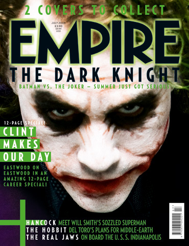
As part of our research stages and to make sure we are following the codes and conventions of a film magazine front cover, as well as finding aspects which we can challenge, we decided to analyse EMPIRE magazine. As it is a well-known, established magazine, which if our media product was distributed we would aspire for it to appear within it, it will allow us to produce a product of the same level. This magazine appeals to our target audience, this is due to the group the magazine hails having a strong interest in film. They focus on the new and up and coming films which the age bracket we are focusing on would be interested in. The publication follows the codes and conventions of a film magazine so it would give us great guidelines for the creation of our front cover.
Looking at this front cover, most of the conventions of a magazine are present and it follows the basic layout of a film magazine. The mast head is across the top in bold, which is a common code and convention, to attract the audience but not so eye-catching that it takes away the affect of the image. The mast head font is associated with Empire magazines, having a constant font theme works to the magazines advantage. It builds a relationship with the audience and a sense of familiarity. As well as making the magazine look visually appealing, at a glance a potential reader would catch the font style and automatically register that the magazine as Empire which may encourage them to stop and look, or even buy. There is also a theme on the front cover of this magazine and all Empire magazines. This makes it look visually appealing to the audience and helps with the overall appeal of the magazine; looking professional and clean cut.
Firstly the 'Joker' which is an iconic character in the film world is featured on the front of the magazine. This instantly hails the audience as it is a very recognised face, even for those who may not have necessarily seen the film he stars in. He is looking at the audience, the magazine is wanting to hail, this is direct address. It has a stronger impact and is used to catch the audiences eye so the 'Joker' engages with the reader to encourage a sale. The specific make-up used on the joker is also a technique to hail in the audience. He looks dramatic and eye catching, as well as mean and mysterious which reflects his role in the film they are advertising. The dark eyes really draw your eyes to the centre of the magazine and link in well the dark surroundings of the jokers face, so all concentration is on his portrait image. The white face and dark surroundings really set a huge contrast which results in the front cover looking even more dramatic and vivid, and more importantly striking to the audience.
The green glow to the font sets a theme through out the front page. Green connotes his theme and role in the film. He is known for these colours, they are his motif. The colour scheme also sets a dark and mysterious theme which also reflects the Jokers role in Batman.
Another film magazine we decided to look at was Total Film. This again follows the codes and conventions similar to Empire, with the layout, sub headings, barcode and central image. The layout follows the same structure as Empire, apart from the image is intruding the mast head. This is a risky layout for a magazine front cover as the title is normally what would draw a potential reader in, but as this magazine is well established the title isn't as important as the effect of the main image.
The theme of this front cover is very mechanical and futuristic, headings and sub headings as well as hooks are also in this theme, as they have a chrome finish to them. This links with the genre of film the magazine is advertising, even if you haven't seen the film you are still intrigued, its a convention to 'sell' this film. The use of red, sets a huge contrast, so the vital elements the magazine wants you to read, to hopefully catch your eye are printed in this vibrant colour.
This magazine is produced for a slightly different purpose than Empire. I feel that Total Film is to advertise the film more than just inform about it, this is because of specific lexical choice like "mind blowing." Which is used more than once, and "ultimate" which are powerful words. It's a busier front cover compared to Empire and seems to be trying harder for a sale whereas Empire is minimal as the image on the front has so much impact that it is probably capable of selling alone. Total Film has also included its website address on the front of its magazine, to again publicise and give readers other options, that suit them to stay in touch, to hopefully keep them interested and to become a loyal reader.
I don't feel the central image is as powerful as Empire's, as the surroundings of the image over powers the actor. I don't feel he draws your eye in at a glance, its more the red lexis, which is why the persuasive words are printed in this colour. They have used indirect mode of address, which i agree with as his facial expression makes you wonder what's out there or what he could be looking at, but to notice and understand this you need to study the image, which is why I feel Empires image is a lot more affective, and we plan to relate to when we create my front cover.

Tuesday 19 October 2010
POSTER DEVELOPMENT

We have created a rough plan of how we want our poster to be layed out. This is a good starting point for us as we can now work on the right angling of the image and ensure we follow the codes and conventions of a poster.
We wanted our poster to include as minimal information as possible so that the attraction isn't taken away from the main image. Having only the bare minimal amount of information, should also leave the audience of the poster with questions. We want it to provoke thought, so that the audience are more eager and interested in finding out the rest of the story line, so result in watching the film. Anchorage is also used with the subtitle; or tag line, as it is linking the text and image to give the image meaning, as it gives an incite into what the film is about.
FONTS
There was a majority of fonts that we were fond of, and so unable to choose one for the font of our film trailer. So we decided to create a poll and hand it to our target audience to see what they feel reflects the genre and film trailer. We plan to use the font with the most votes as then the majority of our target audience will be in favour of it, and it will be what they expect to see and connote with the genre and trailer we are creating.

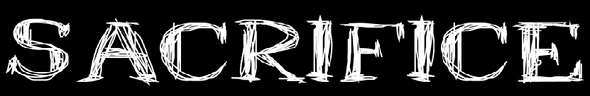
Firstly we thought about what text we should include on the poster and what is included on poster that are already established in the media world. With the poster we had more freedom from conventions, compared to a magazine. We knew it was vital that we had to included detail about the production team and actors, also the production logo is present for the audience to recognise and familiarise it with a film they may have previously watched. The main text on the poster is the same font to the trailer so that the audience can link the two together, also it was decided that this font represented the genre and trailer we were creating the best due to our target audience research, so no other font was an option. The red glow on the title of the film is to increase the tension and mystery. Red is also linked with blood, gore and pain so leaves the audience wondering.

We then inserted the image. We chose to use direct mode of address to hail in the audience, hopefully catching eye contact with the audience would intise the reader and encourage them to watch the film so that the un-answered question they may have about the film are answered. Black and white has been used to connote a dark, mystery and frightening feel to the poster, again linking it to the trailer as that is shot in black and white also. Iconography in the form of a totem pole has been included. This represents ritualistic behaviour which directly relates to our title of 'Sacrifice'. We didn't want our poster to simply represent a murder film but instead a chilling story of someone who is following a certain belief or religion who worships and sacrifices. This is where the use of black and white also links in as this sort of behaviour could be seen as archaic in a similar way that when we think of black and white film, we think of an older time.

After re analysing our poster we felt we needed to include endorsments; personal opinions from respected critics and reviewers to encourage the target audience to watch this film. This is because endorsments are from a third party and so are more trusted from an audiences point of view. After this change, we were happy wth how it looked, but wanted to move the audiences eyes along the poster, so it flowed more.

We then decided to add a BBFC certificate to our poster as we felt that it would cause the audiences eyes to move along the poster, and engage with the text. After placing it we immediatly discovered its benefit and can now finally say we are happy with our final poster.

Final Poster
Subscribe to:
Posts (Atom)