
As part of our research stages and to make sure we are following the codes and conventions of a film magazine front cover, as well as finding aspects which we can challenge, we decided to analyse EMPIRE magazine. As it is a well-known, established magazine, which if our media product was distributed we would aspire for it to appear within it, it will allow us to produce a product of the same level. This magazine appeals to our target audience, this is due to the group the magazine hails having a strong interest in film. They focus on the new and up and coming films which the age bracket we are focusing on would be interested in. The publication follows the codes and conventions of a film magazine so it would give us great guidelines for the creation of our front cover.
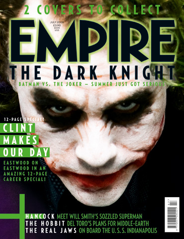
Looking at this front cover, most of the conventions of a magazine are present and it follows the basic layout of a film magazine. The mast head is across the top in bold, which is a common code and convention, to attract the audience but not so eye-catching that it takes away the affect of the image. The mast head font is associated with Empire magazines, having a constant font theme works to the magazines advantage. It builds a relationship with the audience and a sense of familiarity. As well as making the magazine look visually appealing, at a glance a potential reader would catch the font style and automatically register that the magazine as Empire which may encourage them to stop and look, or even buy. There is also a theme on the front cover of this magazine and all Empire magazines. This makes it look visually appealing to the audience and helps with the overall appeal of the magazine; looking professional and clean cut.
Firstly the 'Joker' which is an iconic character in the film world is featured on the front of the magazine. This instantly hails the audience as it is a very recognised face, even for those who may not have necessarily seen the film he stars in. He is looking at the audience, the magazine is wanting to hail, this is direct address. It has a stronger impact and is used to catch the audiences eye so the 'Joker' engages with the reader to encourage a sale. The specific make-up used on the joker is also a technique to hail in the audience. He looks dramatic and eye catching, as well as mean and mysterious which reflects his role in the film they are advertising. The dark eyes really draw your eyes to the centre of the magazine and link in well the dark surroundings of the jokers face, so all concentration is on his portrait image. The white face and dark surroundings really set a huge contrast which results in the front cover looking even more dramatic and vivid, and more importantly striking to the audience.
The green glow to the font sets a theme through out the front page. Green connotes his theme and role in the film. He is known for these colours, they are his motif. The colour scheme also sets a dark and mysterious theme which also reflects the Jokers role in Batman.
Another film magazine we decided to look at was Total Film. This again follows the codes and conventions similar to Empire, with the layout, sub headings, barcode and central image. The layout follows the same structure as Empire, apart from the image is intruding the mast head. This is a risky layout for a magazine front cover as the title is normally what would draw a potential reader in, but as this magazine is well established the title isn't as important as the effect of the main image.
The theme of this front cover is very mechanical and futuristic, headings and sub headings as well as hooks are also in this theme, as they have a chrome finish to them. This links with the genre of film the magazine is advertising, even if you haven't seen the film you are still intrigued, its a convention to 'sell' this film. The use of red, sets a huge contrast, so the vital elements the magazine wants you to read, to hopefully catch your eye are printed in this vibrant colour.
This magazine is produced for a slightly different purpose than Empire. I feel that Total Film is to advertise the film more than just inform about it, this is because of specific lexical choice like "mind blowing." Which is used more than once, and "ultimate" which are powerful words. It's a busier front cover compared to Empire and seems to be trying harder for a sale whereas Empire is minimal as the image on the front has so much impact that it is probably capable of selling alone. Total Film has also included its website address on the front of its magazine, to again publicise and give readers other options, that suit them to stay in touch, to hopefully keep them interested and to become a loyal reader.
I don't feel the central image is as powerful as Empire's, as the surroundings of the image over powers the actor. I don't feel he draws your eye in at a glance, its more the red lexis, which is why the persuasive words are printed in this colour. They have used indirect mode of address, which i agree with as his facial expression makes you wonder what's out there or what he could be looking at, but to notice and understand this you need to study the image, which is why I feel Empires image is a lot more affective, and we plan to relate to when we create my front cover.

No comments:
Post a Comment